

Authentic Tableau TDS-C01 Exam Dumps PDF - Apr-2024 Updated
TDS-C01 Dumps Special Discount for limited time Try FOR FREE
NEW QUESTION # 119
True or False: It is possible to change the Geographic Role of a dimension
- A. True
- B. False
Answer: A
Explanation:
A geographic role associates each value in a field with a latitude and longitude value.
Assigning a geographic role based on the type of location (such as state versus postcode) helps ensure that your data is plotted correctly on your map view. For example, you can assign the City geographic role to a field that contains a list of city names.
To assign a geographic role to a field:
In the Data pane, click the data type icon next to the field, select Geographic Role, and then select the geographic role you want to assign to the field.
When you assign a geographic role to a field, Tableau adds two fields to the Measures area of the Data pane: Latitude (generated) and Longitude (generated).
These fields contain latitude and longitude values and are assigned the Latitude and Longitude geographic roles. If you double-click each of these fields, Tableau adds them to the Columns and Rows shelves and creates a map view using the Tableau background map.
NEW QUESTION # 120
Which of the following are true about dimensions?
- A. Dates are mostly placed in dimensions by default for relational data sources
- B. They affect the level of detail in the view
- C. They contain contain numeric, quantitative values
- D. They contain qualitative values (such as names, dates, or
geographical data)
Answer: A,B,D
Explanation:

Measures contain numeric quantitative values hence that option is incorrect.
Reference 1: https://help.tableau.com/current/pro/desktop/en-us/datafields_typesandroles.htm Reference 2: https://help.tableau.com/current/pro/desktop/en-us/dates.htm
NEW QUESTION # 121
How can you change the Default Aggregation for a measure in Tableau?
- A. By double clicking on the measure, and then choosing Window -> Default Aggregation
- B. By right clicking the dimension -> Default properties and choosing Aggregation
- C. By changing its properties manually every time we need to use it
- D. By right clicking the measure -> Default properties and choosing Aggregation
Answer: D
Explanation:
According to the official Tableau documentation:
Dimensions don't have aggregation properties, and adding properties manually each time defeats the whole DEFAULT aggregation purpose. Window tab doesn't have any default aggregation option!
NEW QUESTION # 122
How can you change the default Tableau repository location?
- A. By clicking on Window -> Repository Location
- B. By clicking on Help -> Change Repository Location
- C. By Moving the repository location manually to wherever we want
- D. By clicking on File -> Repository Location and choosing a new location
Answer: C
Explanation:
According to the official Tableau documentation:
NEW QUESTION # 123
Using the CoffeeChain table, create a chart to see the monthly Percent difference change in Profit, from the beginning of 2012 to the end of 2013. How many months saw a Negative percent difference in Profit?
- A. 0
- B. 1
- C. 2
- D. 3
Answer: C
Explanation:
Follow along to reach the correct answer:
1) First, drag Date to the Column shelf and Profit to the Rows shelf. We need to see the 2 consecutive months over this two year period (2012-2013) so this tells us we need to work with continuous dates:
Click on Date in the Column shelf and convert it to continuous month :
2) Now, click on the Profit pill in the Rows shelf, go to quick table calculation and choose Percent difference:
3) Finally, click on the Show mark Labels icon:
4) We finally have our view, and clearly, 10 Months have a NEGATIVE percent difference:
NEW QUESTION # 124
Which Sub-Category had the least Profit in the Office Supplies category?
- A. Binders
- B. Envelopes
- C. Labels
- D. Fasteners
Answer: D
Explanation:
To reach the correct answer, follow the steps below:
1) Drag Category, and sub-category to the row shelf. Drag Profit to the Column shelf
2) Click the Sort-ascending icon as shown above, to sort the profits from least to greatest as shown:
Click the 'Show mark labels icon'
As we can see, Fasteners has the least Profit in the Office Supplies Category, and hence is our correct answer!
NEW QUESTION # 125
Using the Time-series table, create a cross tab showing the Sales for each Item Number-ID, broken down by Assortments, then add Grand totals to the view. Which Item Number ID made the maximum sales across all assortments?
- A. 0
- B. 1
- C. 2
- D. 3
- E. Correct)
Answer: A
Explanation:
Follow along the steps below:
Drag Assortment and Year ID to the column shelf, and Item Number ID to the row shelf. Next, drag Sales to the Text label to create a cross-tab as below:

NEW QUESTION # 126
Question 30: Skipped
Using the CoffeeChain table, create a scatter plot of Profit (x-axis) vs Sales (y-axis) broken down by State.
Add a Linear trend line to the view. What is its R-squared value?
- A. 0.739284
- B. 0.783262
- C. 0.759329
- D. 0.748472
Answer: B
Explanation:
Trend lines have become popular questions in recent Tableau examinations. Follow along:
1) First drag Sales to the Rows shelf and Profit to the Columns shelf:
c
You will only see a single mark since the view is aggregated.
2) Now, break down this view by state. Drag State into Detail on the Marks shelf ( or directly to the view):
3) Finally, move to the Analytics pane, and drag Trend line to the view. When you drag it, select the Linear option!:
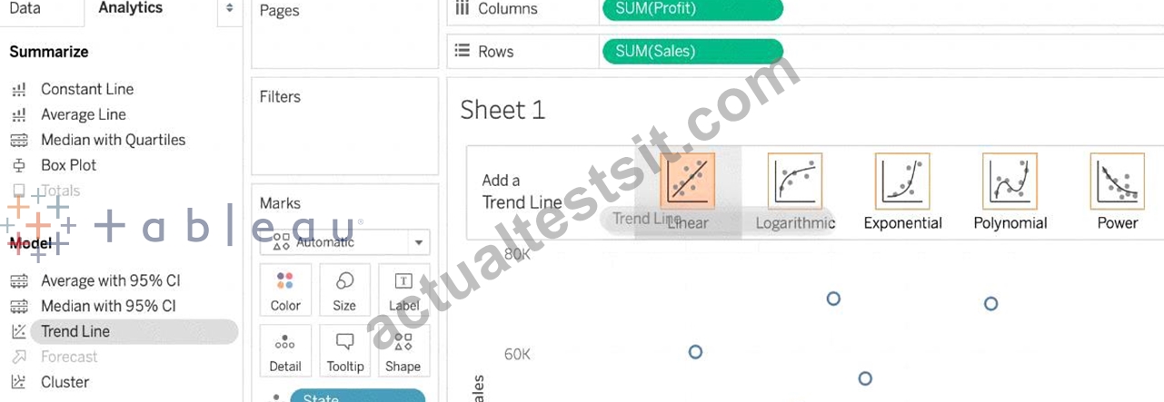
4) The following is our view. Hover over the trend line to see the R-squared value:
NEW QUESTION # 127
Which of the following is an example of a Date Part?
- A. September 2020
- B. Q4 2017
- C. November
- D. March 2019
Answer: C
Explanation:
All answers except November are examples of Date Values (continuous in nature).
See below:
You can see that the option in Green symbolizes our correct answer, i.e only a Month. In our case that month is November (the correct answer).
All other options are combinations of a year with one other value (like a month, quarter, or day). So this is how by looking at an option you can know if its a date part or date value!
NEW QUESTION # 128
True or False: Trend lines can only be used with numeric or date fields
- A. True
- B. False
Answer: A
Explanation:
You can show trend lines in a visualization to highlight trends in your data.
To add trend lines to a view, both axes must contain a field that can be interpreted as a number. For example, you cannot add a trend line to a view that has the Product Category dimension, which contains strings, on the Columns shelf and the Profit measure on the Rows shelf.
However, you can add a trend line to a view of sales over time because both sales and time can be interpreted as numeric values.
NEW QUESTION # 129
Is it possible to use measures in the same view multiple times (e.g. SUM of the measure and AVG of the measure)?
- A. Yes
- B. No
Answer: A
Explanation:
Yes, it is very much possible to use measures in the same view multiple times. For example, refer to the image below:
We are using BOTH the Sum of the revenue and the AVG of the revenue in the same view!
NEW QUESTION # 130
If you decide you want to see all of the marks in the view at the most detailed level of granularity, you can
__________________ the view.
- A. break-down the measures
- B. split the measures
- C. aggregate the measures
- D. sort the measures
- E. disaggregate the measures
Answer: E
Explanation:
The different aggregations available for a measure determine how the individual values are collected: they can be added (SUM), averaged (AVG), or set to the maximum (MAX) or minimum (MIN) value from the individual row values.
For a complete list of the available aggregations, check out - List of Predefined Aggregations in Tableau.
The level of detail is determined by the dimensions in your view-for information about the concept of level of detail, see How dimensions affect the level of detail in the view.
Disaggregating your data can be useful for analyzing measures that you may want to use both independently and dependently in the view. For example, you may be analyzing the results from a product satisfaction survey with the Age of participants along one axis. You can aggregate the Age field to determine the average age of participants or disaggregate the data to determine at what age participants were most satisfied with the product.
Disaggregating data can be useful when you are viewing data as a scatter plot. See Example: Scatter Plots, Aggregation, and Granularity.
NEW QUESTION # 131
If you see the following Filter, then you're working with _______________________ Larger image
- A. Date Values
- B. Grouped Dates
- C. Date Parts
- D. Date Functions
Answer: A
Explanation:
Dates in Tableau will behave differently depending on whether they are a Datepart (blue) or a Datevalue (green). This affects how the axes display/behave and also how visualisations such as line charts will display. The difference essentially boils down to Dateparts behaving like a dimension as opposed to a measure which is how Datevalues behave. This means that Dateparts behave like discrete categories on the view whereas Datevalues are more like continuous numeric values.
Dateparts are discrete and they behave the same as dimension filters. If all dates are used on the filter then each individual date will be a datepart that can be selected/excluded. This is the same for each level of date, if datepart months is placed on filters January to December will be tick-able options in the filter. This also means that conditions and top/bottom filters can be applied to datepart filters like any other dimension filter.
Datevalues placed on filters behave like measure filters. A min and a max date can be set and there is a relative dates option which allows you to choose things like only show the previous 3 months or years etc.
NEW QUESTION # 132
Which of the following are the options to export the data used to build the view / visualisations?
- A. JSON format
- B. PDF File
- C. CSV file
- D. MS Access Database
Answer: D
Explanation:
You can export the data in a Tableau data source, including all or part of the records from your original data. Alternatively, you can export only the portion of data used to generate the view.
Since the question mentions the data used to build the view, we'll focus on that :
*Export data in the view to Microsoft Access or .csv*
Export the data that is used to generate the view as an Access database (Windows only) or .csv file (Mac only).
1) In Tableau Desktop, select Worksheet > Export > Data.
2) Select a location and type a name for your Access database or .csv file.
3) Click Save.
4) If you're on Windows, the Export Data to Access dialog box displays to give you the option to immediately use the new Access database and continue working in Access without interrupting your work flow.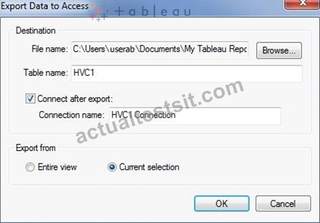
NEW QUESTION # 133
For a ____________ sort, no matter how the data changes, the values will always stay in the sort order we kept stuff in.
- A. Hierarchical
- B. Manual
- C. Random
- D. Topological
Answer: B
Explanation:
For a manual sort, no matter how the data changes, the values will always stay in the sort order you kept stuff in.
From the official website:
NEW QUESTION # 134
What does the following icon do in Tableau?
Larger image
- A. Create a Story
- B. Create a Story and Dashboard both
- C. Create a Dashboard
- D. Create a Worksheet
Answer: C
Explanation:
The icon shown is used to add a new Dashboard! From the official documentation:
NEW QUESTION # 135
Relationships are represented by __________________ and operate at the ____________________.
- A. Venn diagrams, logical layer
- B. noodles, logical layer
- C. noodles, physical layer
- D. Venn diagrams, physical layer
Answer: B
Explanation:
From the official documentation:
The default view that you first see in the Data Source page canvas is the logical layer of the data source. You combine data in the logical layer using relationships (or noodles).
NEW QUESTION # 136
Which of the following are valid Layout Container types when using Dashboards in Tableau?
- A. Diagonal Container
- B. Horizontal Container
- C. Vertical Container
- D. Split Container
Answer: B,C
Explanation:
NEW QUESTION # 137
You want to update the font of an entire workbook.
What should you use to configure the default fonts?
- A. Field labels
- B. The Format Workbook pane
- C. Titles and captions
- D. The Formal Font pane
Answer: B
Explanation:
To update the font of an entire workbook in Tableau, you should use the "Format Workbook" pane. This feature allows you to set and modify the default font settings for the entire workbook, ensuring consistency in font style across all sheets and dashboards. It's a global setting that applies to all visual elements in the workbook, including titles, captions, axis labels, and other text elements.
NEW QUESTION # 138
......
TDS-C01 Dumps for success in Actual Exam: https://www.actualtestsit.com/Tableau/TDS-C01-exam-prep-dumps.html
Realistic TDS-C01 100% Pass Guaranteed Download Exam Q&A: https://drive.google.com/open?id=157xElQCUwYf_hY3OkEs9SfiHuw4sZtY-